


It has become a universal truth that we are awash with data, and there is enormous value in the analysis of this data. You may need to make predictions about the future behaviour of your customers, or you need to know the profile of your users based on the data you are collecting. Correlation and causation which are often confused, are two basic terms that you might have come across.
Every student whose path is crossed by Statistics 101 is familiar with the quote “Correlation is not causation.” If you see two variables moving in the same direction, you might assume that one variable directly causes the other to move in that direction. However, just because there is a correlation between two variables does not necessarily mean that there is causation between the two.
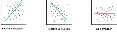
Correlation is a statistical measure that describes the size and direction of a relationship between two or more variables. The correlation coefficient’s values range between -1.0 and 1.0. A perfect positive correlation means that the correlation coefficient is exactly 1. A perfect negative correlation means that two assets move in opposite directions, while a zero correlation implies no linear relationship at all.
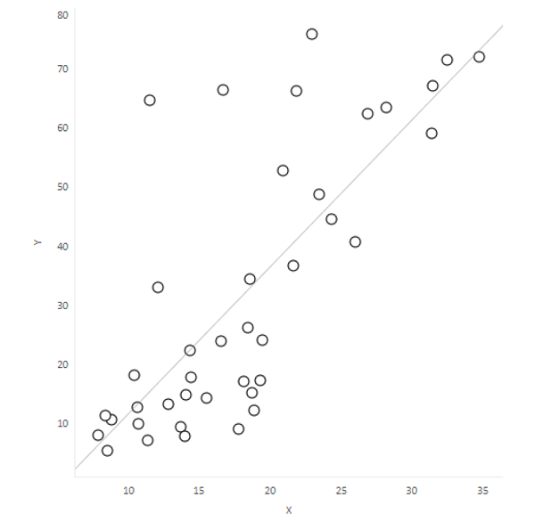
Scatterplots are a common representation of correlation. The example below demonstrates a positive correlation between Deprivation score and estimated smoking prevalence:
Created by Richard Torr
Consider 3 bizarre correlations below:
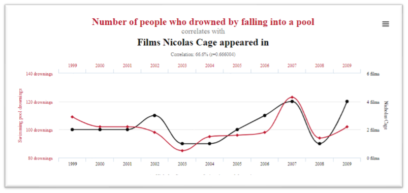
- There exists a strong correlation (66%) between the yearly number of people who drowned by falling into a pool and the number of Nicolas Cage movies.
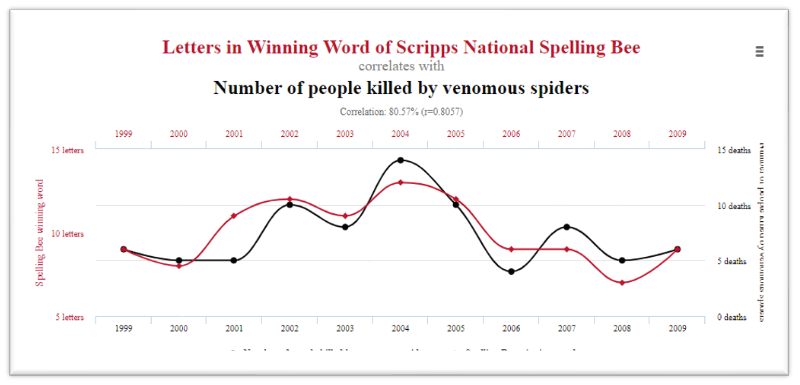
2. There is also a high correlation (80.5%) between the number of letters in Winning Word of Scripps National Spelling Bee and the number of people who killed by venomous spiders
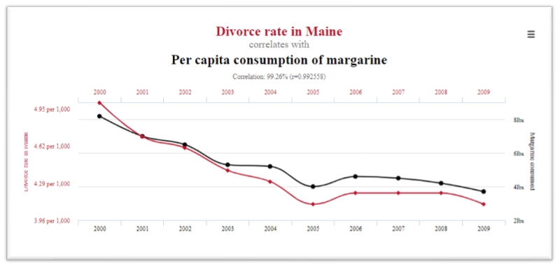
3. There is an almost perfect correlation (99%) between the divorce rate in Maine and the per capita consumption rate of margarine.
Although these are ridiculous examples, they serve as a reminder that it is always possible to find a relationship between numbers and we must be careful when working with correlations. We should not immediately conclude that one must affect the other.
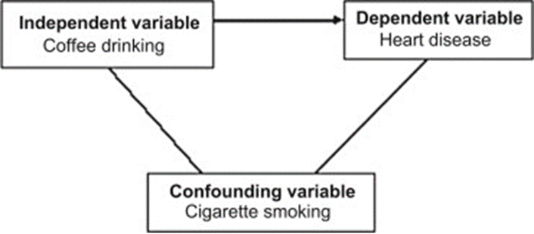
In a well-structured experiment, the independent variable typically affects our dependent variable. A confounding variable can have a hidden effect on your experiment’s outcome and may distort or mask the effects of another variable. Confounding is a distortion (inaccuracy) in the estimated measure of association between the independent and dependent variables that occurs when the primary exposure of interest is mixed up with some other factor that is associated with the outcome. For example, a hypothesis that coffee drinkers have more heart disease than non-coffee drinkers may be influenced by another factor. Coffee drinkers may smoke more cigarettes than non-coffee drinkers, so smoking is a confounding variable in this study. The increase in heart disease may be due to smoking and not coffee.
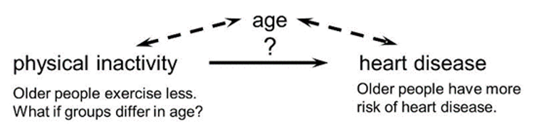
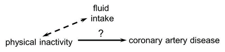
In the diagram below, the primary goal is to ascertain the strength of association between physical inactivity and heart disease. Here, age is our confounding factor, because older people are more likely to be inactive (called exposure), and this as well is associated with the outcome (because older people are at greater risk of developing heart disease).
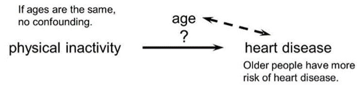
If the age distribution is similar in the exposure groups being compared, then age will not cause confounding.
For confounding to occur, the extraneous factor must be associated with both the primary exposure of interest and the disease outcome of interest.
Subjects who are physically active may drink more fluids (e.g., water and sports drinks) than inactive people, but drinking more fluid does not affect the risk of heart disease, so fluid intake is not a confounding factor here.
‘Causality’ which Judea Pearl[3] calls “the new science of cause and effect” goes beyond the concept of correlation.
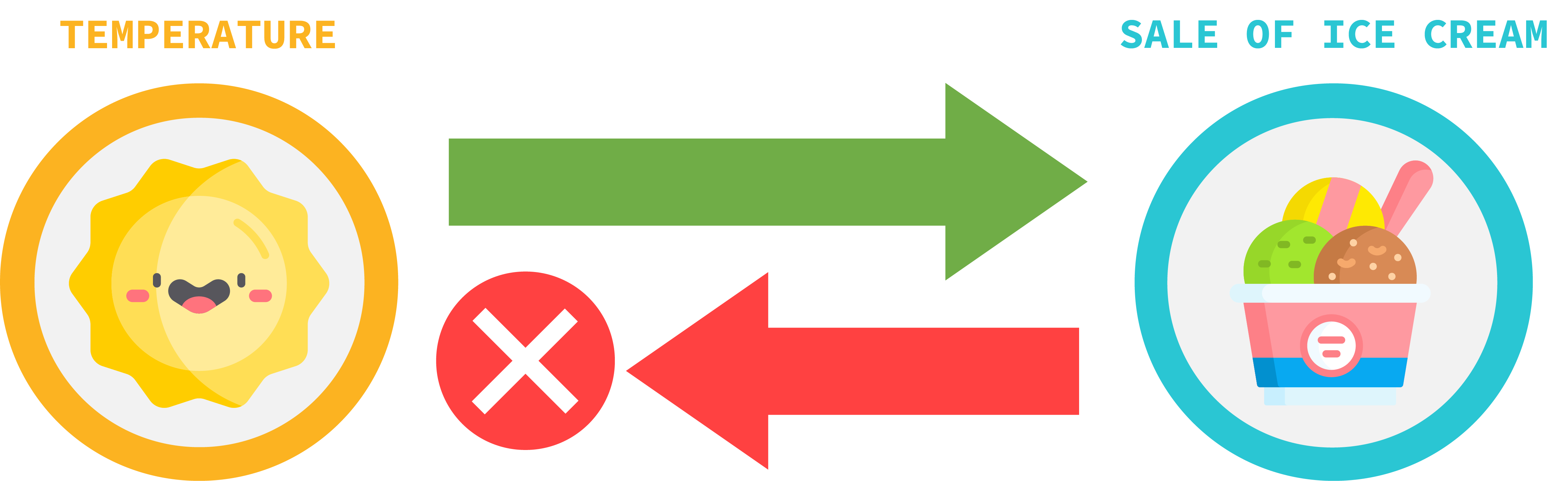
As this diagram demonstrates – the temperature impacts the sale of ice cream, but the sale of ice cream doesn’t have any impact on the temperature.
A variable, X, can be said to cause another variable Y, if when all confounders are adjusted, an intervention in X results in a change in Y, but an intervention in Y does not necessarily result in a change in X. This contrasts with correlations, which are inherently symmetric i.e., if X correlates with Y, Y correlates with X, while if X causes Y, Y may not cause X.
‘The Ladder of Causation’ diagram illustrates three levels of causal reasoning:
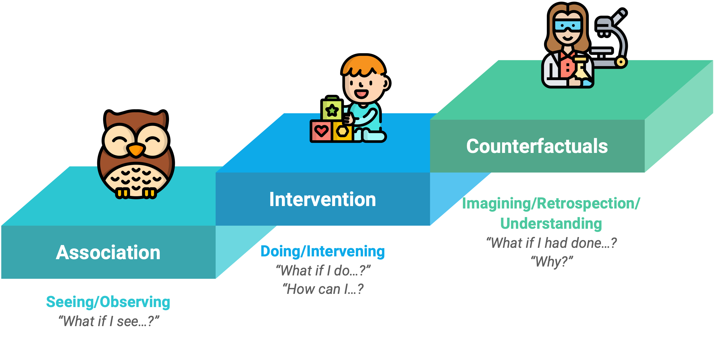
The first level which is named ‘Association’, discusses associations between the variables. Although crucially causality is not invoked, questions like ‘Is the variable X associated with the variable Y?’ can be answered on this level. Many of the early 20th century statistical tools, such as correlation and regression operate on this level.
The second level of the causation is ‘Intervention’ which answers the questions like ‘If I make the intervention X, how will this affect the probability of the outcome Y?’ For example, the question ‘Does smoking increase my chance of lung cancer?’ exists on the second level of the ladder of causation. This kind of reasoning invokes causality and can be used to investigate more questions than the reasoning of the first rung.
The third level of the ladder is ‘Counterfactuals’ and involves answering questions which ask what might have been, had circumstances been different. Such reasoning invokes causality to a greater degree than the previous level. An example counterfactual question given in the book is ‘Would Kennedy be alive if Oswald had not killed him?’ and ‘What if I had not smoked for the last 2 years?’
We can test for causation by running experiments that track each variable while also excluding other variables that might interfere. In a controlled study, the sample or population is split in two, with both groups being comparable in almost every way. The two groups then receive different treatments, and the outcomes of each group are assessed.
As many data scientists think, while data is a bare thing, answering questions from data, and interpreting it correctly and sensitively is as much art as it is science. This “new science of cause and effect” provides a theoretical framework to help give direction to this art.
At Caja we help our clients understand their data and make decisions backed by understanding and evidence to improve their processes, if you’d like to learn more about how we can support you, reach out to arrange a meeting with a member of our data science team.
Sources
Tulchinsky, Theodore H., and Elena A. Varavikova. “Measuring, Monitoring, and Evaluating the Health of a Population.” The New Public Health (2014): 91.

